UX Audit Checklist: Turn a Confusing SaaS Website into a Clear, High Converting Experience


A practical UX Audit Checklist you can run in a few hours to spot friction, clarify your message, improve usability, and increase trial or demo conversions without a full redesign. Meta description: Use this UX Audit Checklist to find where users get stuck on your SaaS site and fix messaging, navigation, content, mobile UX, forms, trust, and conversion flow fast.
A SaaS website can look premium and still feel exhausting.
Not because the UI is ugly.
Because the experience makes people think too much.
They land on your homepage and immediately start asking silent questions:
What does this do
Is it for me
How fast can I get value
What happens after I click
Can I trust this
If your site is creating questions instead of answering them, a redesign is not your first move.
Your first move is a UX Audit Checklist.
It helps you find friction with surgical clarity, then fix the highest impact issues without tearing everything down.
Below is the UX Audit Checklist I use when a SaaS site feels “polished” but conversions are flat.
What a UX Audit Checklist actually does
A UX audit is a structured review of your site’s experience. It checks whether the design, content, and flow match real user intent.
A good UX Audit Checklist focuses on:
- Clarity: do users instantly understand the value
- Momentum: do users always know what to do next
- Confidence: does the site build trust fast
- Effort: how much thinking and clicking is required
- Consistency: does everything feel predictable across pages and devices
The outcome is not a long report.
The outcome is a prioritized fix list that moves conversion.

When you should run a UX Audit Checklist
Run it when any of these are true:
- Traffic is decent but trials or demos are low
- Users bounce fast on landing pages
- People click around but do not commit
- Support gets repetitive pre sales questions
- Mobile conversion is noticeably weaker
- Stakeholders keep saying “make it more modern” but you cannot prove what is broken
A UX Audit Checklist replaces opinions with evidence.

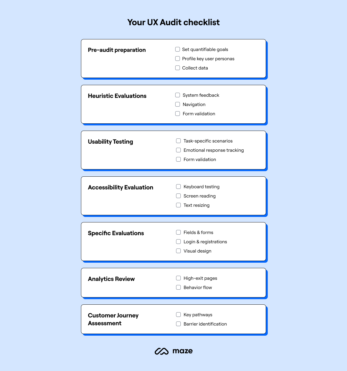
The UX Audit Checklist for SaaS websites
1. First 5 seconds test
Open your homepage and answer these without scrolling:
- What is the product
- Who is it for
- What outcome does it create
- What is the primary action
- Why should I trust it
If any answer is unclear, your hero section is not doing its job.
Fix ideas:
- Lead with outcome, not features
- Add one primary CTA only
- Add one proof signal near the CTA (logos, numbers, testimonial line)
2. Primary action is truly primary
Most SaaS sites accidentally offer 5 competing actions: Start free trial, Book demo, Watch video, Explore features, Pricing.
That creates hesitation.
Checklist:
- One main CTA across the site
- Secondary CTA exists but visually quieter
- CTA labels are specific (Start free trial, Get a demo, See pricing)
- Same CTA placement pattern on every key page
3. Information architecture and navigation sanity
Users do not want to explore your sitemap. They want a fast path to “Is this right for me?”
Checklist:
- Navigation has 5 to 7 items max
- Labels match user language, not internal team language
- Features are grouped by jobs to be done, not by modules
- Pricing is easy to find
- Use cases or industries are easy to find if relevant
Fix ideas:
- Replace vague labels like Solutions with Use cases
- Remove duplicate paths that lead to the same content
- Make Pricing and Security visible for B2B
4. Visual hierarchy and scanning
People scan before they read. If everything is loud, nothing is heard.
Checklist:
- One clear headline per section
- Real spacing between sections
- Key benefits are in scannable bullets
- Important buttons stand out without shouting
- Too many boxes and borders are removed
Fix ideas:
- Reduce competing accent colors
- Use fewer font sizes, but stronger hierarchy
- Replace long paragraphs with structured blocks
5. Copy that sounds like a human, not a brochure
A common conversion killer is robotic writing: “Leverage robust solutions to optimize workflows.”
Users do not talk like that.
Checklist:
- Sentences are short
- Benefits are concrete
- “You” language is used naturally
- Jargon is removed or explained
- Every section answers a user question
Fast rewrite pattern:
- Problem: what is frustrating today
- Promise: what becomes easier
- Proof: why you can believe it
- Path: what to do next
6. Feature sections prove value, not volume
Feature lists often become a product manual.
Your site is not the app. Your site is the sales experience.
Checklist:
- Each feature connects to an outcome
- Each feature includes a screenshot or micro visual
- You show before and after moments
- You show time saved or errors reduced when possible
- You avoid listing features that do not influence purchase
Fix ideas:
- Convert “Feature grid” into “Outcome stories”
- Add a simple 3 step “How it works” section
7. Friction audit for forms and sign up
Forms are where intent dies.
Checklist:
- You ask for the minimum
- You explain why you need any extra field
- Errors are clear and kind
- Password rules do not punish users
- Social login or magic link is available if it fits your product
Fix ideas:
- Reduce fields to email plus password where possible
- Move company size, role, phone number later
- Make the first success moment happen fast after sign up
8. Mobile experience is not “responsive”, it is usable
Many sites technically resize, but still feel cramped.
Checklist:
- Tap targets are big enough
- CTAs are not buried under huge images
- Sticky headers do not steal space
- Pricing table is readable without horizontal pain
- Modals and popups are not aggressive
Fix ideas:
- Mobile first layout for the hero and CTA
- Break pricing into cards instead of tables
- Increase spacing around inputs and buttons
9. Trust and risk reversal
People are not only buying features. They are buying a decision.
Checklist:
- Social proof appears early, not only at the bottom
- Security and privacy are easy to find
- Refund policy or cancellation clarity is obvious
- Real customer logos or testimonials exist
- You show who is behind the product
Fix ideas:
- Add one line like “Cancel anytime in two clicks” near the CTA
- Add security page link in footer and pricing
- Use testimonials that mention outcomes, not generic praise
10. Speed, accessibility, and “invisible” UX
If the site feels slow or hard to read, people leave silently.
Checklist:
- Page loads fast on mobile data
- Text contrast is readable
- Headings follow a logical structure
- Images are optimized
- Animations do not distract from the CTA
How to use this UX Audit Checklist in 90 minutes
If you want a fast process:
- Choose one key journey (Homepage to pricing to trial, or landing page to demo)
- Run the checklist while screen recording your thoughts
- Mark every moment you hesitated, scrolled back, or felt unsure
- Turn findings into a priority list:
- Must fix: blocks conversion
- Should fix: reduces confidence
- Nice to fix: polish
- Fix the top 3 items first, then measure
What “good” looks like after the audit
After applying this UX Audit Checklist, the site should feel like it is guiding users, not challenging them.
Users should:
- Understand the product faster
- Click with confidence
- Reach pricing and sign up with fewer detours
- Ask fewer basic questions before starting
- Convert more from the same traffic
And most importantly, the experience should feel respectful of their time.
Final thought
UX is not decoration.
UX is decision design.
If your SaaS website feels heavy, do not rush into a redesign.
Run a UX Audit Checklist first, fix the real friction, and let the metrics tell you what to build next.


-1.png)